MOM’s Organic Market
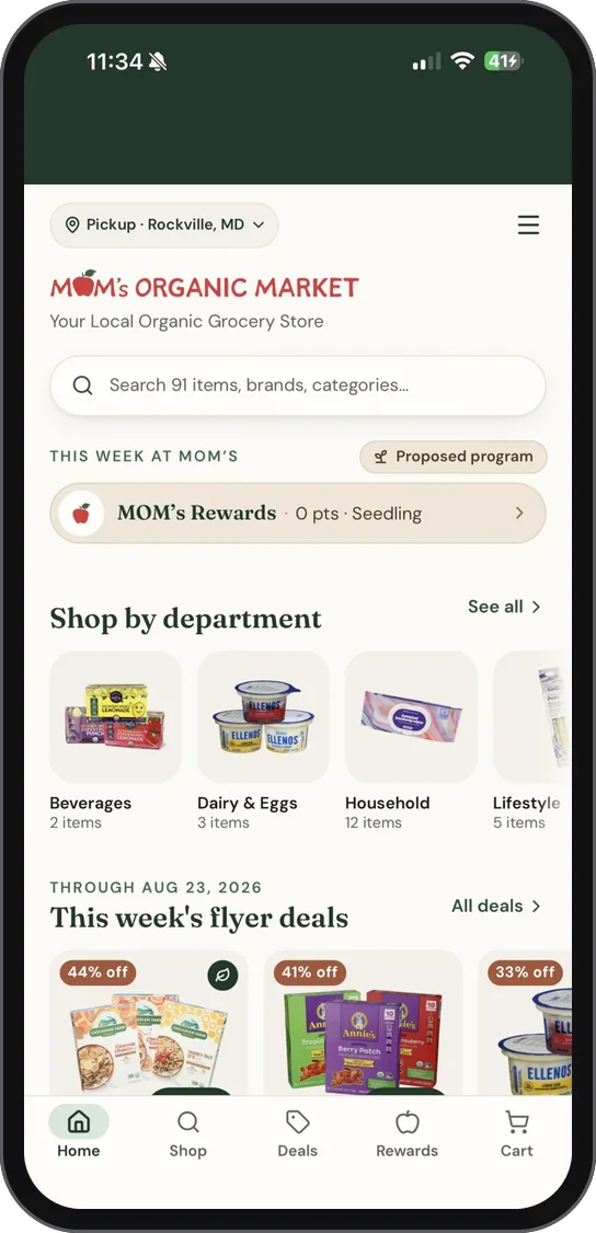
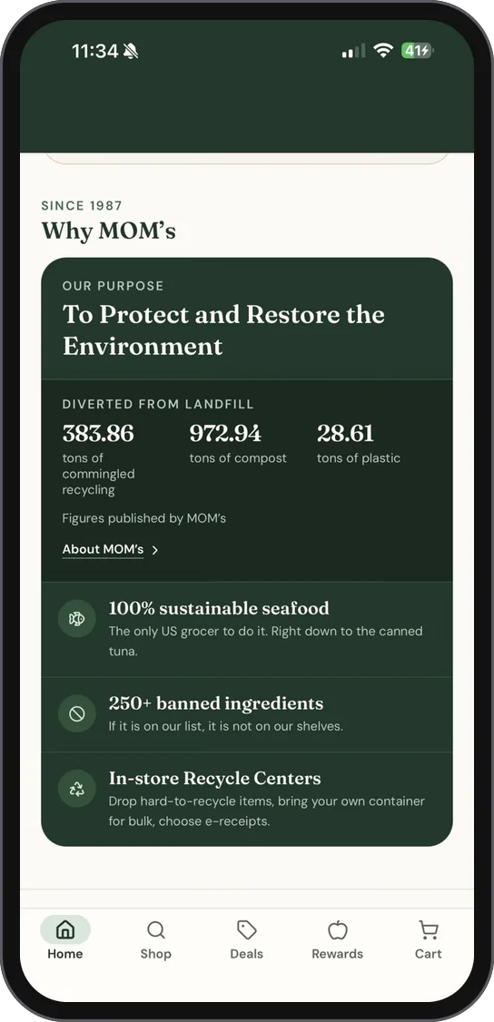
An iPhone shopping app designed and built for MOM’s Organic Market: the weekly flyer as clippable deals, the whole catalog in search, and rewards built around the market’s environmental mission.
The project in one row: the work, the service, the work.
01Overview
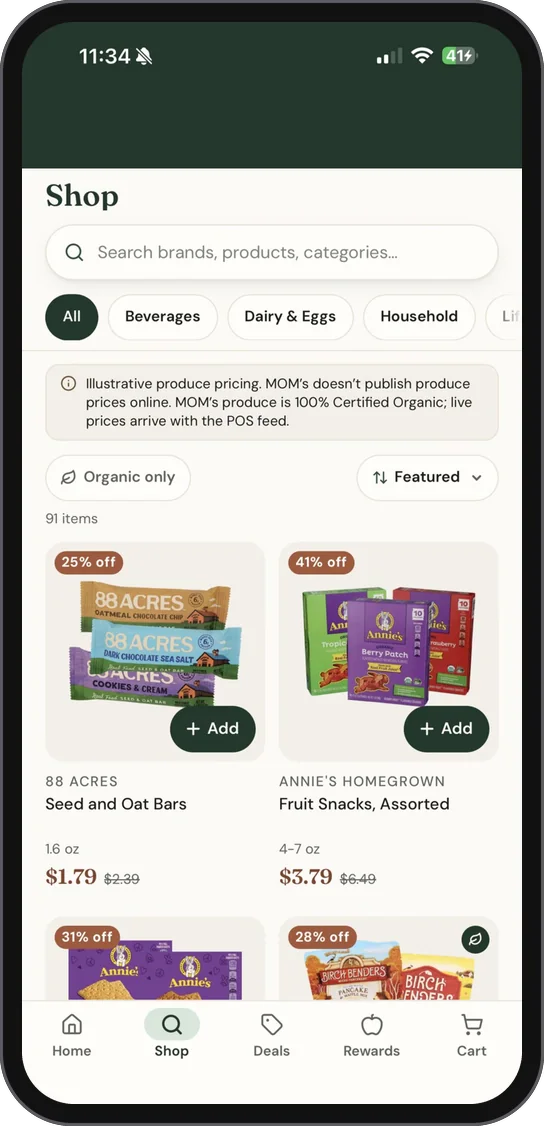
MOM’s Organic Market is an organic grocer with stores across the Mid-Atlantic. We designed and built a native iPhone app for it, filled with the market’s own catalog: every item from its monthly sales flyer at its sale price, each product photo cut out clean, with search by brand, product or department and an organic-only filter.
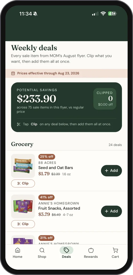
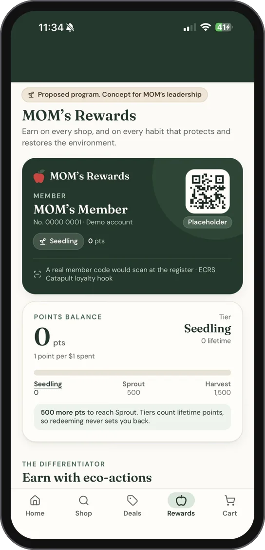
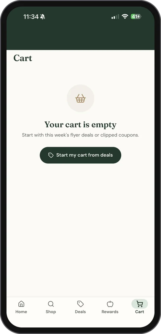
Deals turns the flyer into coupons you clip, with the total a shopper could save at the top. A store picker covers every location with today’s hours, and a proposed rewards program pays points for eco-actions, like bringing your own container or dropping off hard-to-recycle items, not only for spending.
The look is MOM’s own: deep forest green, warm cream and a muted rust, set in Fraunces and DM Sans, with MOM’s red apple for the mark and the app icon.
What we delivered
- iPhone app design
- iOS app build
- Clippable weekly deals
- Catalog search and product cutouts
- Store picker
- Rewards concept
- App icon and launch screen
02Gallery
Screen by screen.
03Brand notes
MOM’s, in your pocket.
The app is dressed in MOM’s own identity: its logo and red apple, a forest green and warm cream, and a serif for the headlines that feels like the market’s own signage.


- Forest#1E3A2B · the header, buttons and cards
- Cream#FDFBF7 · the ground
- Rust#C4714F · savings and sale badges
- MOM’s red#DA383C · the mark
- MOM’s green#426148 · the brand’s own green
FrauncesHeadlines: Weekly deals, MOM’s Rewards, Why MOM’s
DM SansEverything else: prices, sizes, buttons and tabs
App Design
Have a project like this?
iPhone and Mac apps, designed and built in-house: the screens, the icon and the App Store listing.